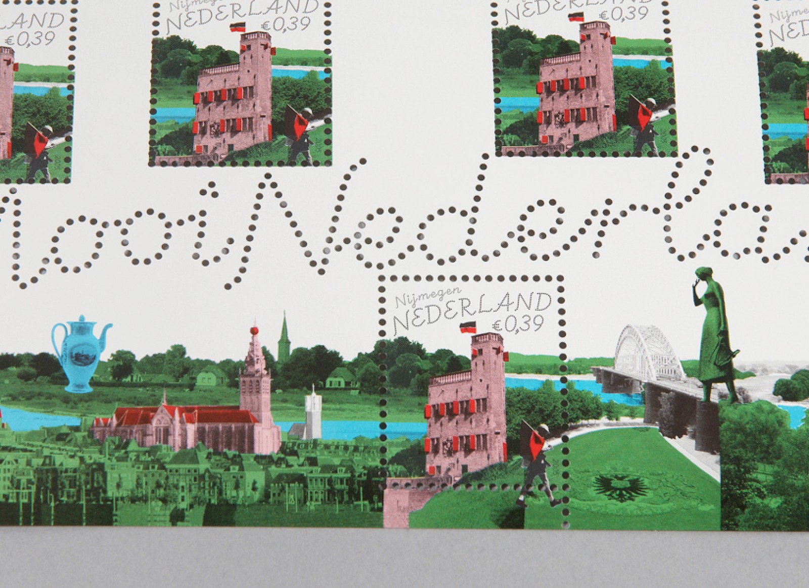
The stampsheet illustrates a playful and personal interpretation of the city, the aim was not to create the perfect ‘brand-able‘ image: in Nijmegen Mariken from Nimegen walks as a giant over the bridge over the Waal and the participant of the 4-daagse carries a flag of the local football team NEC.
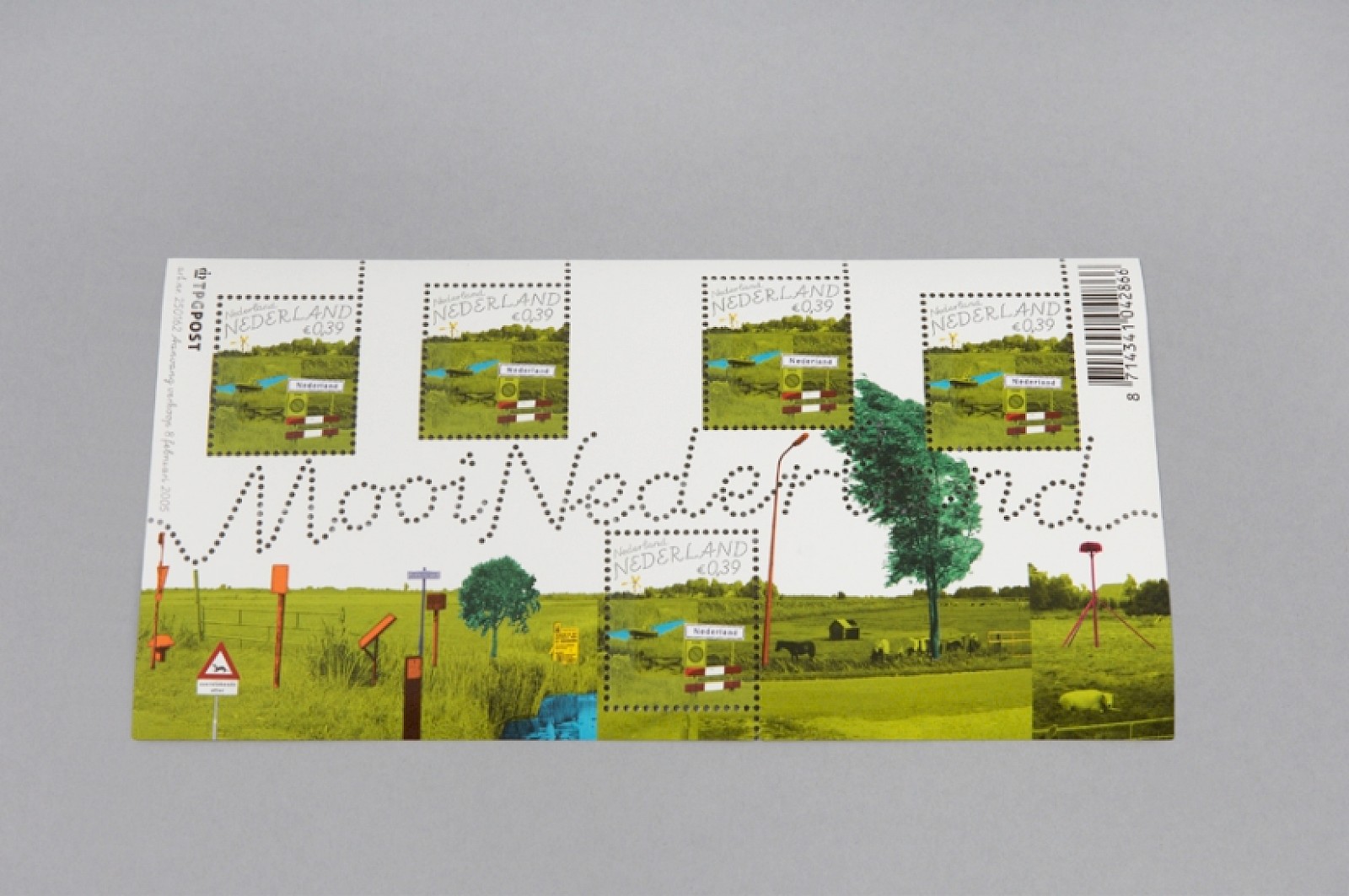
First in the series was the stamp of Nederland, a small village in the province of Overijssel. The pictures are converted to black and white and colored in with a defined pallette chosen for the whole series. To concentrate all the eye-catching elements into one sheet and to create a sometimes surreal effect the collage technique is used.
The title of the series were punched into the sheet of stamps. This is a unique technique used in the international history of stamps. A dotted variation of the typeface ‘Schulschrift’ was designed for this, and was also used in the typography on the stamps themselves.
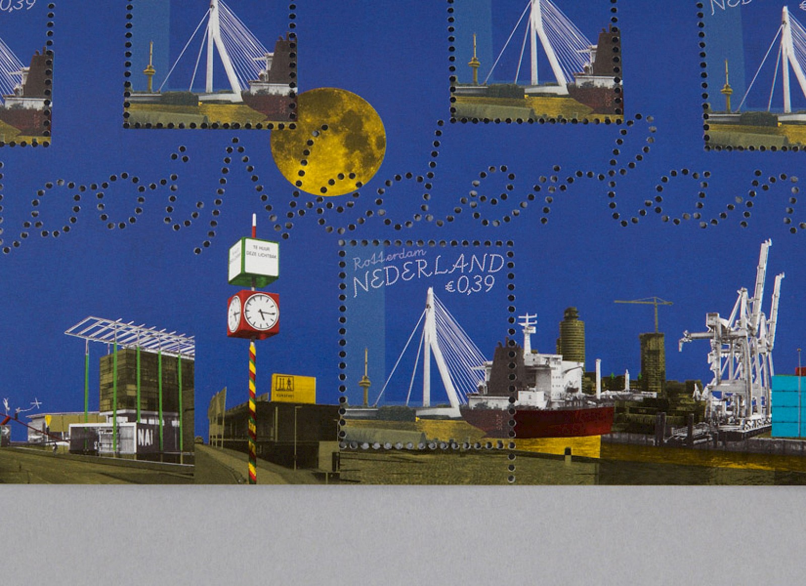
The stamp of Rotterdam shows the city by night, to emphasize the Erasmus bridge by Ben van Berkel.
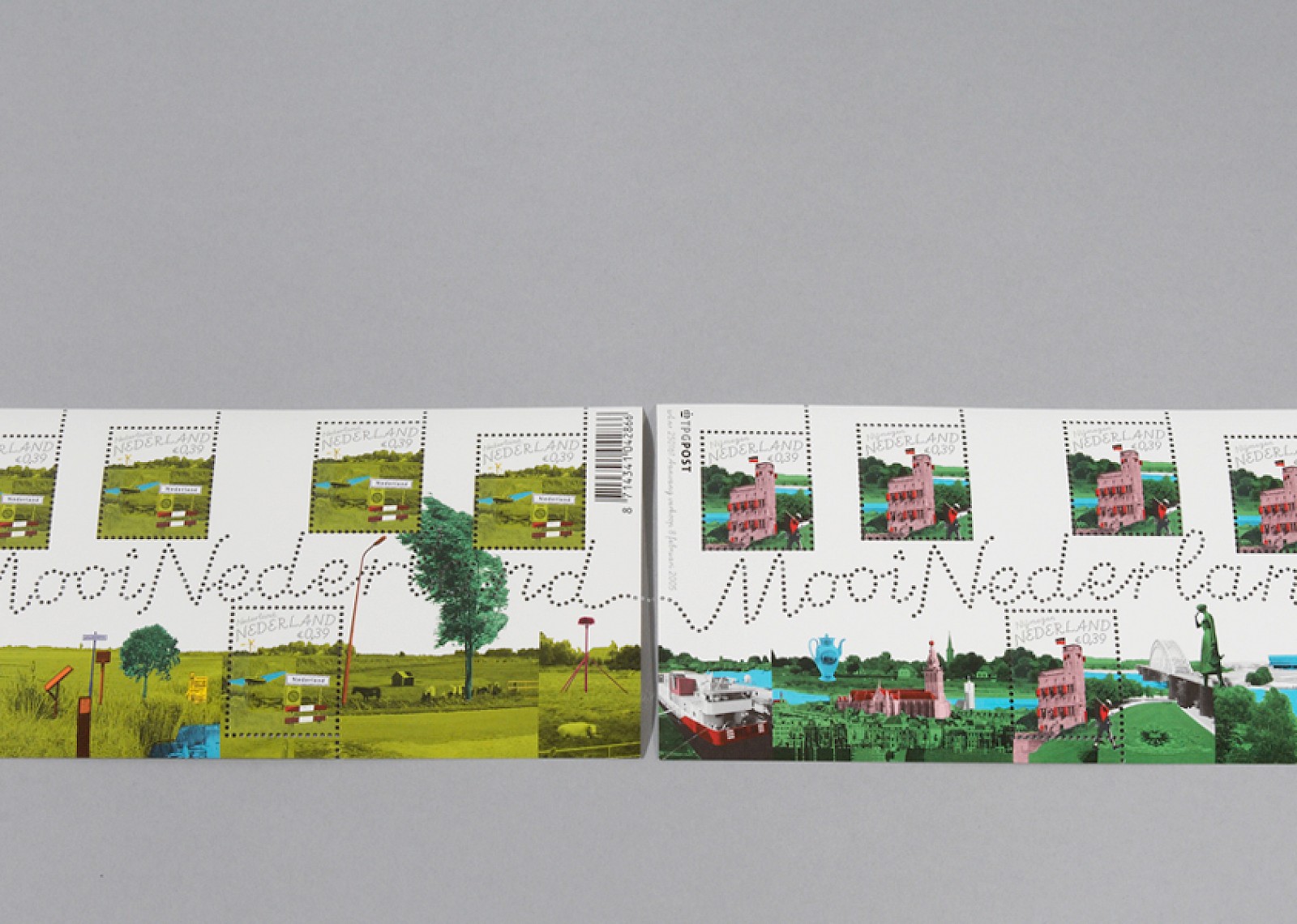
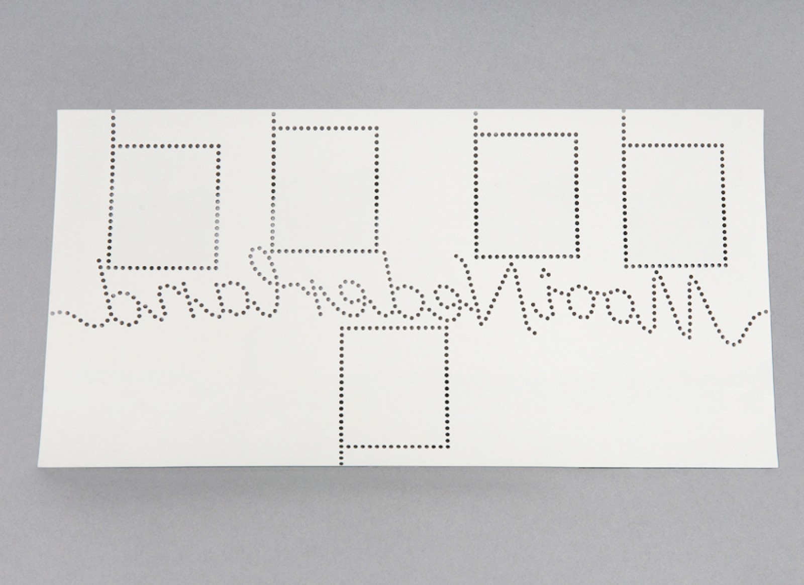
When connecting all the individual stamp sheets a larger panorama is created.
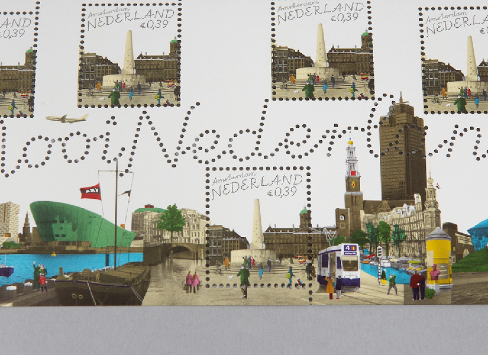
On this sheet of Amsterdam a new and very compact skyline is depicted by using images of the Calatrava bridge of Ijburg to the Amsterdam Arena. This variety of icons accentuates the modernisation of the city.