
Auke de Vries: Sculptures, Drawings and Work in Public Space Provides a chronological account of the evolution in the visual work and the artistic career of Auke de Vries. Since he is still working a photograph of his studio was chosen for the cover.

Auke de Vries is best known for the elegant and whimsical sculptures made out of what seems a collection of forms he developed over the years. Most of these sculptures are called ‘untitled’.

Besides the 3500 photographs to choose from decisions about the text had to be made, writer Antoon Melissen was asked to make a ‘string’ of quotations taken from many different texts, adding biographical facts about De Vries’ professional life.

The book contains 446 pages and offers an immense amount of information, nevertheless the airy and playful layout seduces you to keep on looking and reading.

There is no designed system or grid in which the images had to fit. It was decided to make for each spread a unique compostition.

Some pictures that ar inspirational to Auke de Vries are included in the book.
Text and image are combined on every page. There is nothing you have to look up, all the information is at hand: explanations, footnotes, captions, dates, etc.

Various bleeding pictures, the reader can almost ‘take a walk’ in those huge photographs.

The very diverse layout makes the images exciting to look at even after 400 pages!
You can have a quick look here:

The text that accompanies the pictures is like a thread of the story. The text stops literally where the image takes over, and then starts again just were it ended...

For the text part at the beginning of the book, the typeface Times was printed on green-grey paper. In this way the ‘contemplative’ part and ‘the book itself’ are distinguished from each other.

Each thin wrapper (one after every 16 pages) shows one piece of the same sculpture. It makes beautiful combinations and as a subtle interruption these pages capture your attention.

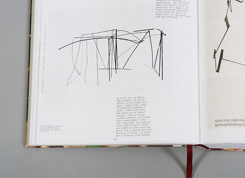
This overview of 50 years of work in text and image is almost like a good look into the archives of this artist. The use of the typeface Courier and the prominent dates and descriptions at the top of pages refer for that reason to archives.

The parts (out of one sculpture) that are shown on the thin pages refer to the collection of forms the artist developed in his oeuvre and that he constantly uses in different ways.